Game Service Landing Page: Build a Winning Digital Arena
Understanding the Core Visual Identity
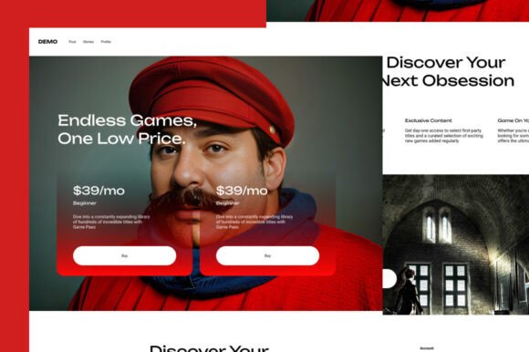
The Game Service - Landing Page UI kit is more than just a collection of buttons and headers; it is a carefully constructed digital environment designed to handle the high-energy demands of the gaming industry. When you first open the Figma file, you will notice a distinct personality that balances modern typography with functional space. The visual style typically leans into a "dark mode" aesthetic, which is a staple in web design for gamers, utilizing deep backgrounds to make neon accents, gradients, and promotional graphics pop. This isn't just about looking cool; it is a strategic choice to reduce eye strain during long browsing sessions while highlighting calls to action.
The layout relies heavily on a grid system that accommodates high-resolution imagery. Whether you are showcasing a cloud gaming interface or an esports tournament bracket, the design provides ample room for visuals without cluttering the user experience. The personality of this kit is authoritative yet accessible. It speaks the language of professional gaming—precision, speed, and reliability. By using a mix of bold sans-serif headings and clean body text, the kit establishes a visual hierarchy that guides the user’s eye naturally from the hero section down to the pricing tables and community features.
Strategic Applications for Designers and Entrepreneurs
If you are an entrepreneur launching a gaming subscription service or a designer building a portfolio for a gaming client, this kit offers a solid foundation for brand identity. The versatility of the Game Service - Landing Page components allows it to adapt to various sub-niches within the industry. For instance, the layout modules are perfectly suited for a logo design presentation or a landing page for a new indie game release. The components are built to be fully customizable, meaning you can adjust the color palette to match specific brand guidelines without breaking the layout structure.
Consider the practical application for a small business owner running a local esports arena. You need a site that looks professional but doesn't require months of custom coding. This kit serves as a set of premium design assets that streamline the process. You can utilize the pre-built sections for schedules, team rosters, and ticket sales to create a functional MVP (Minimum Viable Product) in a fraction of the time. For content creators and streamers, the kit can be adapted to create a centralized hub for merchandise, stream schedules, and sponsorship information, ensuring that the brand perception remains consistent across all digital touchpoints.
Typography, Readability, and User Experience
While the prompt notes that the file uses dummy images, the structural integrity of the typography is where the real value lies. The kit relies on free fonts, which is a massive advantage for commercial projects. You avoid the headache of complex licensing issues while still achieving a high-end look. The typeface choices included in the kit are selected for their readability on screens. In the context of a landing page, legibility is paramount; users need to scan pricing tiers and feature lists quickly.
The font pairing strategy within the kit typically contrasts a heavy, impactful display font for headers with a highly legible sans-serif for body copy. This contrast creates a dynamic visual rhythm. It prevents the page from feeling monotonous and helps distinguish between different content blocks. For example, a bold, slightly condensed header might be used for "Tournament Rules," signaling importance, while a wider, lighter weight is used for the description text. This attention to typographic detail elevates the project from a simple template to a polished web design solution. It influences how users perceive the service's professionalism—sloppy type choices can make a service look amateurish, whereas this kit ensures a polished, trustworthy appearance.
Maximizing the Potential of the Figma File
To get the most out of the Game Service - Landing Page file, you should approach it as a modular system rather than a static page. The components are designed to be mixed and matched. If you are working on social media graphics to promote the launch, you can pull specific UI elements—like a stylized pricing card or a "Play Now" button—and use them in your Instagram stories or YouTube thumbnails to maintain visual consistency.
Here are a few practical recommendations for implementation:
- Color Customization: While the default dark theme works well for gaming, do not be afraid to invert it for specific sections like "Support" or "FAQ" to create visual separation and reduce monotony.
- Image Integration: Since the file uses placeholders, ensure your actual game assets or screenshots are high-quality. The layout is built to handle large hero images, so blurry assets will ruin the effect.
- Mobile Responsiveness: Check how the components stack on mobile devices. Gaming audiences are often split between desktop and mobile, so the UI kit provides a solid starting point, but you must verify that interactive elements like tournament brackets remain usable on smaller screens.
- Interactive Prototyping: Use Figma’s prototyping features to simulate the user journey. For a cloud gaming service, simulate the flow from "Sign Up" to "Select Game" to ensure the layout supports the necessary user actions.
Ultimately, this kit is a tool for acceleration. It removes the guesswork from layout and spacing, allowing you to focus on the unique value proposition of your game service. By leveraging the clean structure and thoughtful design of the Game Service - Landing Page